How to Create Compelling Hotel Brochures
June 30, 2022
How Variable Data Printing Gets Your Direct Mail Noticed
July 29, 2022Brochure design is one of the most popular and effective methods of reaching a target audience because a compelling and eye-catching design provides material that can easily be digested by those viewing the brochure. When a prospect sees custom brochures, they know they can get the information they want to find at their own pace and without a lot of hype.
While brochure design is a powerful marketing strategy for delivering information about your benefits to prospective customers, it is easy to commit common design mistakes that turn a brochure design into nothing more than paper that is hard to understand or process. In order to create a compelling brochure that shares the benefits of your business, products and services to the public, take a look at the design tips listed below.
Natural Flow In The Brochure’s Layout
Every brochure needs to have a clear goal at the start of the design process in order for it to succeed. Think of the brochure as a sequence of events that run from the conception stage to the actual printing of the brochure. Each step will lead logically from one to another in order to reach the end goal. You should create an outline to organize your ideas and to make sure you have a roadmap for the brochure design.
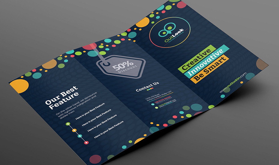
The design of custom brochures is all about directing the eye of the viewer to where you want them to look. A brochure full of random text and graphics of all shapes and sizes will make your content look chaotic instead of organized. Readers can be confused and overwhelmed when they don’t know where to look so be sure your layout makes sense.
Avoid Using Too Many Fonts
The choice of the font for the brochure can have a big impact on its success. Here are some items to keep in mind when making your selection:
- Choose legible fonts so the text is easy to read. Stay away from handwritten or script fonts that can make the brochure hard to understand.
- Limit your font selection to two font choices that complement each other. The use of multiple fonts that don’t mesh aesthetically will look unprofessional instead of being design savvy. It is okay if your fonts contrast but they should never be in conflict.
- You should limit yourself to four standard font sizes. Use these fonts to help you stay consistent and organized so the content is aesthetically pleasing and easy to follow.
Don’t Use Low Quality Images in Your Brochure Design
When creating a brochure, you might be tempted to use photos regardless of whether or not they are appropriate for the design. Everything should have a purpose in the design and this is true for photos that should augment your message with optimum effectiveness. You can even decide to not include photos and explore the option of using well-designed text that is placed where photos might go.
Your brochure markets your business and creates an image of your company in the mind of consumers. Poor quality images can deliver the message that your business doesn’t care enough to take the time to create a positive impression.
Make Sure to Include White Space In Your Brochure
An overcrowded brochure design is a design mistake and so is a lack of white space on the brochure. White space allows the eyes of your reader to relax as they browse your brochure. The use of too much color, text or images can be hard on the eyes and make it hard to read and understand. Keep the design simple and avoid a crowded look through the strategic use of white space that keeps your images and text far away from borders and margins. This effective use of white space leaves plenty of room around all of the images and design elements.
Print and Material Quality Matter with Your Brochure
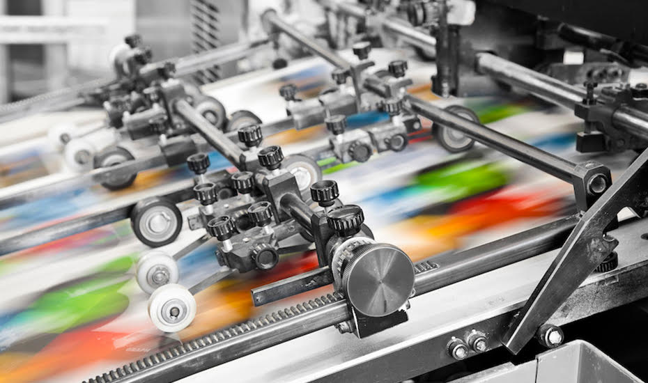
While this might not really be a design mistake to avoid, it is definitely important enough to mention and consider when designing your brochure. The use of low quality print materials or hiring a cheap printer could end up costing you money, time and the professional image you want in the eyes of the public. Take the necessary time to communicate the end goal of your brochure with your printer. In addition, the printer should know your budget in order to help you get the most out of it while still providing high-quality printed results.
A well-thought out brochure design can promote your business whenever it is viewed by the public. It is important to create quality content through a unique and creative design and then once your brochure design is complete, to partner with a printer who understands your goals.
Contact Us Now for More Information
Phone: (707) 927-1315
